Timeliness of Pantone Classic Blue Color of the Year
Pantone Classic Blue Color of the Year 2020
One or two people have *somewhat* jokingly referred to 2020 as the Jumanji year. Though I’ve been stuck at home, I feel like I’ve been running through a jungle, mud clinging to my face, trying to anticipate what terrible struggle is waiting right around the corner. I should note that I’m thankful for family and friends who are taking the COVID-19 pandemic seriously, are physically well, and that Cliff and I have been able to survive being home together around the clock. 😉 Therefore, it might sound trivial to post an article about Pantone’s Color of the Year released months ago, but just follow along and I think you’ll see where I’m headed.
My current job provides a very unique perspective into our new reality – as a member of a small, family-run business who works with food, has had to adjust our retail operations, and is a member of the gifting industry, our ability to note trends and stay nimble during this crisis is of greater necessity than previous years. I recently read an article published pre-pandemic impact in the U.S. forecasting trends for the gifting/retail industry, specifically, what themes will be popular during the winter holidays, how consumers approach shopping, the influence of social media, and how Pantone did an effective job of selecting a color of the year that is approachable and much-needed. Fast-forward a few months, as we all try to figure out what our new normal should entail, and I must agree, the Pantone Classic Blue 19-4052 selection is a refreshing color to lead us forward.
Call it “tried and true” or a safe bet, but blue is such a beautiful, versatile color. Pantone’s decision was intended to provide a color that:
- Calms
- Offers a solid foundation to the decorator’s palate
- Provides depth and challenges our minds to dip below the surface
- Confidence
- Reliability
Perhaps most importantly, it’s an easy color to apply to materials that range in texture. It evokes a variety of moods, allowing artists and designers to bring to life a variety of sensations; which also highlight the fact that its ease means it can translate to a multi-sensory experience.
“‘The Pantone Color of the Year highlights the relationship between trends in color and what is taking place in our global culture at a moment in time, a color that reflects what individuals feel they need that color can hope to answer,’ said Laurie Pressman, vice president of the Pantone Color Institute. ‘As society continues to recognize color as a critical form of communication, and a way to express and affect ideas and emotions, designers and brands should feel inspired to use color to engage and connect.’” (Gifts & Decorative Accessories, Jan. 2020 p.50)
What is Pantone?
If you are new the decorator space, Pantone serves as the standard-bearer of the color/printing industry. Their innovative systems solves an issue that we have all probably experienced since we were old enough to start drawing outside inside the lines with markers…colors look different on different platforms, mediums, etc. It can be so frustrating! This NJ-based company developed a universal system of color language all the way back in 1963 (who knew?) to help maintain consistency and provide a more organized, systematic language to help designers, brands, and companies establish their identities and effectively complete projects. This has grown to trend forecasts as well; including the Pantone Color of the Year, Fashion Runway Color Trend Reports, color psychology, among others. In fact, Pantone collaborated with other companies to evoke the multi-sensory experience we discussed earlier…from the sound associated with Classic Blue to the texture that truly captures its essence.
I think the motivation behind the color selection was rooted more in the political season that would have been more active without the COVID-19 interruption. Times of volatility impact consumers (as does everything), so what most likely started as a color to contrast the vibrancy of 2019’s color and offer a stable trend for a potentially tumultuous year ends up finding a renewed need in this time of social isolation, virtual design collaboration, stress, and an upheaval of our normal routines.
What are some neat color resources from the pros?
If you are homeschooling, working from home, attempting to design a new space from the comfort of your couch, or are just interested in predicting consumer trends for the remainder of this Jumanji game, here are some of the best free tools to learn more about color and find the perfect design elements to take your project/Mom goals/design effort to the next level.
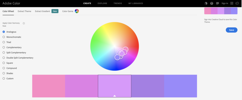
Offers a color wheel, theme building, gradients, and trend analysis across industries (architecture, fashion, graphic design, and more).
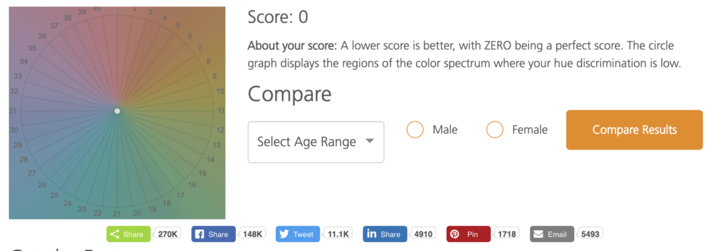
Determining whether or not you can effectively arrange color hues has probably never crossed your mind as an interesting exercise, but I had a blast testing my ability. After evaluating your results, Pantone will provide indicators about the hues where you are less discriminatory. Not only that, but they provide some interesting tidbits about factors, gender differences, and other pieces of info that you can add to your memory bank.
Why Pantone’s Classic Blue Color of the Year is Particularly Relevant Now
- With more people turning to outdoor activities as a means to sufficiently social distance – whether it’s through gardening, hiking, exploring outdoor photography, or just appreciating Mother Nature’s beauty in a new way – the Pantone Classic Blue compliments the earthy tones that were already popular and now, even more so.
- Stability and calm is needed with the new mental stressors coming in seemingly new forms each day. I mean, come on…murder hornets?!
- The versatility of this color should allow for a more streamlined approach to design, a new outlet for those looking to create, and provide more universal enjoyment. Whenever we can bridge divides, even if it’s in the world of color, we should never pass on the opportunity.
Blue was already my favorite color, but now I have a deeper appreciation for it. Are you enjoying the Classic Blue Color of the Year or would you prefer something a little more daring? I bet many of you already have this (or a similar color) in your home décor. Turns out, I've had it in my running shoe wardrobe longer than it's been a color of the year! 😂Share with us, so we can all enjoy!
Until next time, cheers to your #hearthhealthhappiness!
One Comment